
Everyone working for an MP, in whatever capacity, will find themselves creating documents for a variety of purposes. In this guide Conrad Taylor, who has been doing this for many years, will look at ways to make the documents you create on computers more attractive, more professional looking and more legible.
As a starting point may I introduce you to Robin Williams – a Californian graphic designer, writer and teacher, whose career has run spookily parallel to my own. We’re even the same age.
In my case, I learned graphic design working on magazines and newsletters, but was drawn to the production of reports, documentation and learning materials. In the early 1980s, I handed copy to professional typesetters, specifying and proofreading phototypeset matter. Then, in 1985, I discovered what was heralded as ‘Desktop Publishing’. Companies were sold the promise that if they bought a DTP system, their staff could produce professional documents in house. What was not mentioned, was that there was more to that than buying a Mac or PC and installing PageMaker. It also required a software upgrade to the ‘meat computer’ running between your ears.
For nearly 20 years, I trained people how to become better document and magazine designers using computers. In parallel, Robin Williams was doing the same. In the early 1990s she wrote a book provocatively titled, ‘The Mac Is Not A Typewriter’. She soon followed that with another, ‘The PC Is Not A Typewriter’. Both are still available via online booksellers. What I’m about to tell you is similarly drawn from my own experience of design and publishing, applied to today’s technology.
Boss your fonts around!
When you look down at your computer keyboard, it does indeed look like a typewriter. But there is more to that keyboard than meets the eye. By pressing key combinations I can invoke the names of footballer João Mário and the ABBA composer Björn Ulvaeus, and the cities of Køpenhavn, Luleå, Besançon and A Coruña. I can insert the symbols ® and © and of course €, and refer to today’s temperature as 24˚C.
More prosaically, I can improve the typography of my everyday documents by typing the ‘en dash’ (–) and the ‘em dash’ (—), and create a proper ellipsis character… (By the way, ‘en’ and ‘em’ are valid words from the world of typesetting – and you can use them in Scrabble!)
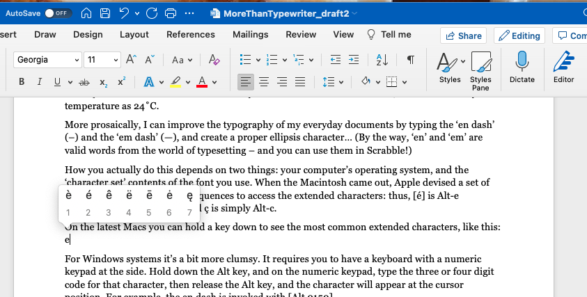
How you actually do this depends on two things: your computer’s operating system, and the ‘character set’ contents of the font you use. When the Macintosh came out, Apple devised a set of easy-to-remember keypress sequences to access the extended characters: thus, [é] is Alt-e immediately followed by e, and ç is simply Alt-c.
On the latest Macs you can hold a key down to see the most common extended characters
For Windows systems it’s a bit more clumsy. It requires you to have a keyboard with a numeric keypad at the side. Hold down the Alt key, and on the numeric keypad, type the three or four digit code for that character, then release the Alt key, and the character will appear at the cursor position. For example, the en dash is invoked with [Alt 0150].
There are several reference pages on the Web to help you with these Windows character codes, for example https://www/alt-codes.net.
Over time, font standards have changed, some fonts have thousands of available characters, and now there are characters you can’t access with a keyboard shortcut or an [Alt] numeric code. If you need that (e.g. to refer correctly to the Polish city of Łódź), learn how to access the Windows character map utility, or its equivalent for Mac or Linux. Or you might have it built in as a facility in your software. I am writing this in OpenOffice (it’s free!) and under the Insert menu I can invoke a table of the characters in the font I am using, with the menu item [Special Character…].
The importance of controlling space. And spacing
In typography, we can say that type matter consists of ‘Ink’ and ‘Space’. My focus here is the space between lines, and between paragraphs. The appearance and professionalism of your documents will be transformed!
Most office documents are printed to A4 paper, with rather narrow margins; OpenOffice defaults to margins of two centimetres each side. The column of type is therefore wider than you would find printed in a book or magazine. As your eye scans back from the end of one line to the beginning of the next, it is hampered by the need to identify which line to latch onto. Furthermore, as you read each line, the type above and below tends to intrude into your central field of high-resolution vision which is what you need to concentrate on.
Matters can be improved hugely by varying the ratio between the type size and line spacing. I’m writing this draft using a TrueType font called ‘Georgia’, at size 11pt. If I use the normal ‘single linespace’ configuration the channel of space between the lines appears rather squeezed. To compensate, I deliberately use a ‘fixed linespace’ setting of 5mm. Immediately, legibility is improved and the tone of the page is lightened.
And what of the space between paragraphs? I never make inter-paragraph space by pressing the carriage return key twice. Instead, I’ve set up the Body Text style so each paragraph inserts an extra 2.5mm space after it. As for my subheadings, in Arial 13pt, they get 4mm extra space above, and 2mm space below, bringing them into a better logical relationship with the text that follows.
Isn’t this a lot of work to do? Not really, because I’ve set up formatting stored in a list of Paragraph Styles. With a single click, I can tell a paragraph – ‘you are a Text Body paragraph, so behave according to the formatting definitions I’ve set up for you!’ And it does what it’s told. In my following article I shall describe in detail how you can make use of this powerful feature of just about all modern word processors and publishing software.
There is a comprehensive set of tutorial on aspects of Microsoft Word on the Microsoft Support website at
You can also read the next article looking at ways to improve your efficiency and consistency using Paragraph and Character Styles.