Document formatting with Styles
In Your computer is more than a typewriter, I wrote about how you can improve the appearance and legibility of documents by fine tuning spacing between lines of type, between paragraphs, and around headings. Perhaps I made it sound like hard work. Now I’ll explain how to make life easier with the use of Styles.
If you look at professionally designed publications, you will notice a regular and repeated pattern to the design of text, headings, captions, etc. So it was in 1984 when my wife Noi and I became the design and production team for a small serious magazine, Inside Asia. The editors wanted to follow the pattern of other serious news and analysis magazines, particularly Time, and Far Eastern Economic Review. I promised our typesetters that we would communicate our requirements as clearly as possible.
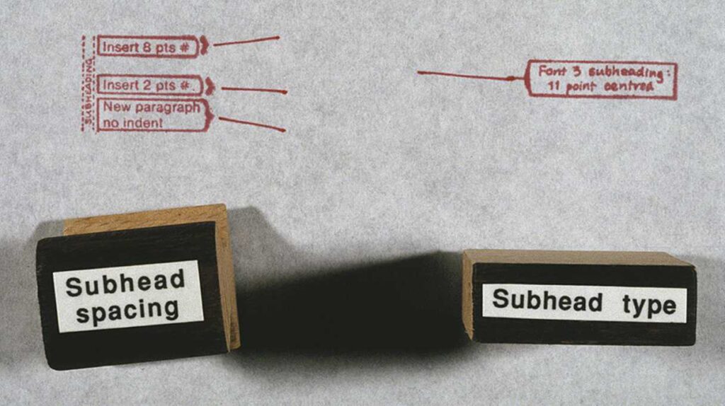
In those days that involved working with typescripts, prepared with a large left margin; taking a fine red pen; and writing typographic instruction and British Standard marks (BS 5261 – 1976) to comprehensively ‘mark up’ the copy. Our repertoire included standard text paragraphs in Times New Roman, justified, with an indented first line; block quotes indented left and right with space above and below; subheadings in Helvetica Bold; headlines in Franklin Gothic bold; an enlarged ‘standfirst’ paragraph; and photo captions.
Marking up copy for a 48-page magazine could get pretty boring. Then we had a bright idea. On our next trip to Bangkok, we took artwork for a set of 20 rubber stanps, and got two sets made. The face of each stamp had comprehensive typesetting instructions, and to the wooden handles we added a more generic name such as ‘Subhead’. Even our editors could understand those! And so we accelerated the mark-up of copy.

Setting up and using paragraph styles today
In word processors like Microsoft Word or OpenOffice, and in more capable publishing software such as Adobe InDesign, FrameMaker or Affinity Publisher, you can set up your own ‘box of rubber stamps’. Most programs come with a ready-to-use set, but you can add to them and redefine them.
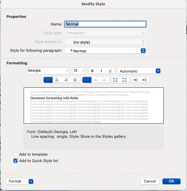
In the software I’m using to draft this, my redefinition of the style ‘Text body’ specifies the font Georgia, at 11pt size, and colour black; custom linespacing of 3 mm; no indents left or right, or to the first line; with an extra 3 mm space after each paragraph. To apply the style, I place my text cursor anywhere in a paragraph, or select a range of paragraphs; and click ‘Text body’ from a styles menu – and that’s it! Now, all those paragraphs have consistent formatting, done in the twinkling of an eye.

It can be time-consuming to set up a customised set of styles, and you wouldn’t bother if ywriting just a letter or a quick memo; but if you are asked to prepare a thirty-page report with three levels of heading, block quotes from other documents, and several ranges of bullet points, you will give yourself a big Thank You for doing so.
Here’s a bonus tip: once you have made that document, you can save it as a Template. Even if you delete all of the contents, the Styles will still ‘haunt’ the template ready for the next report you have to make.
Several times I have been called in by organisations to prepare sets of template documents. I’ve done it in Word, PageMaker, and notably in FrameMaker, a serious software package for creating documentation, books and software manuals.
For example, Incomes Data Services was publishing six regular journals. They wanted to refresh the designs, and give them a more co-ordinated appearance. Their production team knew how to use Paragraph Styles, but they were wary of setting them up. First I analysed the journals and the kinds of content in them, then I took sample copy from old editions, and went through numerous iterations of designing, printing and co-evaluating until everyone was happy.
More elaborate paragraph styles
The definition of a paragraph style can include whether a paragraph is a bullet item, and if so, what symbol to use for the bullet, what colour it should be and with what amount of indenting. Or a heading might be numbered. For my friend’s PhD thesis we had a FrameMaker template with headings numbered to four levels deep (e.g. 3.14.6.2). When her supervisor suggested she move one chapter, the whole lot re-numbered themselves ‘automagically’!
Other useful definitions you can make could include forbidding a multi-line bullet point from breaking over a page boundary, or forcing a heading to stay on the same page as the next three lines of text. In narrow columns where the text is justified left and right, you will probably want to permit hyphenation, and in more sophisticated software you can set rules for how extra space will be distributed between words and characters, and the minimum number of characters before or after the hyphen.
Paragraph styles can be based on previously defined paragraph styles. The Incomes Data Services journals were a case in point. First I set up the style ‘Body para’, with each first line being indented 4 mm. Then I made a derived style called ‘First para’ — exactly the same except with no first-like indent. I then set up ‘Bullet point’ based on ‘First para’, but with the appropriate bullet symbol, a tab, and an indent from the left margin…
Character styles
A character style is usually created as an override to the normal setting for text. I first encountered this when using a specilist document editing programme called FrameMaker to prepare training materials, where I would want a special emphasis on a technical word being defined for the first time. I wanted it formatted as a sans-serif font, bold, and with the size minutely adjusted. I set that up on a menu of character styles and used it as needed. Otherwise, I know I would have gone mad!

